· tutorials · 2 min read
Responsive Pardot Form iFrames using Seamless.js
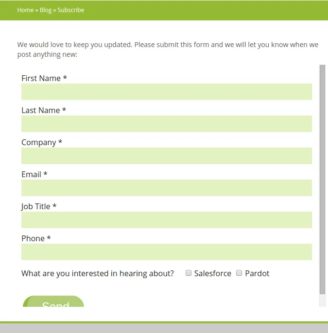
Standard Pardot forms require that you embed them as iFrames, and this can cause issues as iFrames are typically embedded using a fixed height. This results in Pardot forms having scrollbars on certain devices and screen sizes like so:
At first I tried using a library called iFrameResizer to dynamically render the iFrame height, but I ran into issues with the iFrame being slightly cut off at various screen sizes (and not displaying well at all on mobile). Fortunately, I found the perfect solution for embedding Pardot Form iFrames thanks to the seamless.js library from Travis Tidwell. According to the project’s Github repo, “A seamless iFrame makes it so that visitors are unable to distinguish between content within the iframe and content beside the iframe. Seamless.js is a JavaScript library (with no dependencies) that makes working with iframes easy by doing all the seamless stuff for you automatically.”
Add Seamless to your Pardot Layout Template
The first step in the process is to add the Seamless library to your Pardot layout template. We will need to use the seamless.js child page code for this as the child page is the page that your iframe will be referencing (hence it is a child page of the parent page). Navigate to the look and feel section of your Pardot Layout template, and add in the following code in the Above form section’s code box:
<script src="https://cdn.jsdelivr.net/npm/seamless@1.4.1/build/seamless.child.min.js"></script>
<script type="text/javascript">

  // Connect to the parent page.
  window.seamless.connect();
</script>
Now save the changes.
Add Seamless and a Pardot iFrame to your Website
The next step is to add the seamless.js parent page code to any webpages where your Pardot iFrame will reside:
<script src="https://cdn.jsdelivr.net/npm/seamless@1.4.1/build/seamless.parent.js"></script>

<script type="text/javascript">
  window.onload = function () {
    // Turns the iframe into a seamless iframe.
    window.seamless(document.getElementById("your-form-id"));
  };
</script>

<iframe
  id="your-form-id"
  src="https://<your-partdot-form-url>"
  width="100%"
  scrolling="no"
></iframe>
Make sure to replace the id field with your desired form id, as well as update the iFrame src to point to your form (you can get the URL from within Pardot). Once this code is in place, your Pardot iFrame should display without any height issues.
Conclusion
Using seamless.js, my Pardot form iFrames displayed perfectly on all kinds of screen sizes including mobile, and the time to put the fix in place was minimal. If you have any questions regarding the process, don’t hesitate to leave a comment or contact me!